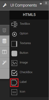
Label
The label component displays a single line of text and identifies some other element or activity on a web page. It can also control the alignment and size of a label. Label components don’t have borders. It has only text.
|
|
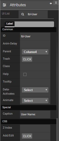
Attributes
|
|
||||||||||||||||||||||||||||||||||||||||
Events
Name |
Description |
Click |
When the label is clicked. |
Double Click |
When the label is double clicked. |
Mouse Down |
When the label is pressed down. |
Mouse Enter |
When the mouse pointer is moves in label while it is over. |
Mouse Leave |
When the mouse pointer is moves on over an label. |
Mouse Move |
When the mouse pointer is moving while it is over an label. |
Mouse Out |
When the mouse pointer moves out of a label. |
Mouse Over |
When the mouse pointer is moves on label while it is over. |
Mouse Up |
When the mouse pointer is pressed up. |
Focus In |
When the label is clicked. |
Focus Out |
When the mouse pointer is pressed while it is over a label. |
Created with the Personal Edition of HelpNDoc: Full-featured Documentation generator