Icon
Icon component is displaying a single or multiple Icons in page. Individual Icons can be customized according to your preferences. It is used with Layout, Grid component, etc. The Icon can come from a URL.
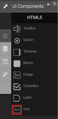
1. Icon in Palette |
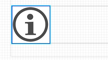
2. Sample Icon |
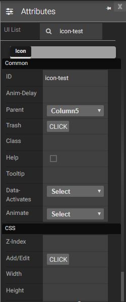
Attributes
|
|
Events
Name |
Description |
Click |
When the Icon is clicked |
Double Click |
When the Icon is double clicked. |
Mouse Down |
When the Icon is pressed down. |
Mouse Enter |
When the mouse pointer is moves in Icon while it is over. |
Mouse Leave |
When the mouse pointer is moves on over a Icon. |
Mouse Move |
When the mouse pointer is moving while it is over an Icon. |
Mouse Out |
When the mouse pointer moves out of a Icon. |
Mouse Over |
When the mouse pointer is moves on Icon while it is over. |
Mouse Up |
When the mouse pointer is pressed up. |
Focus In |
When the Icon is clicked. |
Focus Out |
When the mouse pointer is pressed while it is over an Icon. |
Click |
When the Icon is clicked |
Double Click |
When the Icon is double clicked. |
Mouse Down |
When the Icon is pressed down. |
Created with the Personal Edition of HelpNDoc: Full-featured EPub generator