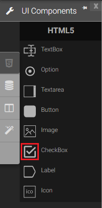
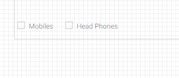
Check box
A checkbox is a square box that can be selected or deselected. When it is selected, a check mark appears in the box. You can add a text label to a checkbox and place it to the left, right, above, or below the checkbox. It is allows the user to select a true or false condition and is used to set a value on or off.
|
|
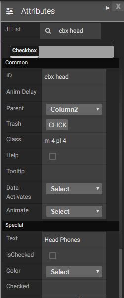
Attributes
|
|
Events
Name |
Description |
Click |
When check box is clicked |
Double Click |
When the check box is double clicked. |
Mouse Down |
When the check box is pressed down. |
Mouse Enter |
When the mouse pointer is moves in check box while it is over. |
Mouse Leave |
When the mouse pointer is moves on over a button. |
Mouse Move |
When the mouse pointer is moving while it is over a check box. |
Mouse Out |
When the mouse pointer moves out of a check box. |
Mouse Over |
When the mouse pointer is moves on checkbox while it is over. |
Mouse Up |
When the mouse pointer is pressed up. |
Focus In |
When the check box is clicked. |
Focus Out |
When the mouse pointer is pressed while it is over a check box. |
Methods
Get value Method: Will return the Boolean value of the check box.
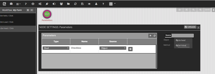
Set value Method: Will set the Boolean value of the checkbox.

Created with the Personal Edition of HelpNDoc: Benefits of a Help Authoring Tool