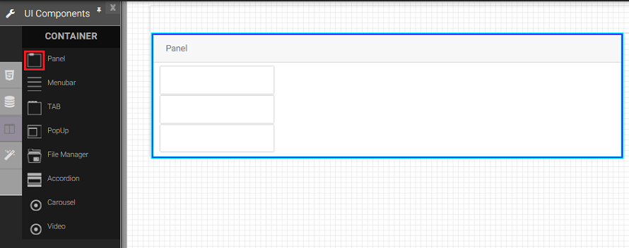
Panel
The panel component creates a container for settings that control the visibility of one, or several, components in an application.
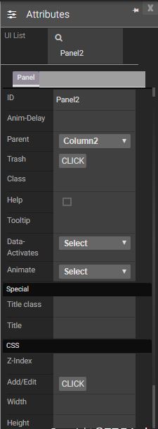
Attributes
|
|
Events
Name |
Description |
Click |
When the panel is clicked |
Double Click |
When the panel double clicked. |
Mouse Down |
When the panel is pressed down. |
Mouse Enter |
When the mouse pointer is moves in panel while it is over. |
Mouse Leave |
When the mouse pointer is moves on over an panel. |
Mouse Move |
When the mouse pointer is moving while it is over a panel. |
Mouse Out |
When the mouse pointer moves out of a panel. |
Mouse Over |
When the mouse pointer is moves on panel while it is over. |
Mouse Up |
When the mouse pointer is pressed up. |
Focus In |
When the panel is clicked. |
Focus Out |
When the mouse pointer is pressed while it is over a panel. |
Created with the Personal Edition of HelpNDoc: Create help files for the Qt Help Framework