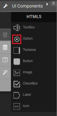
Option
Option is small circular icons that are selected when activated. Option allows the user to select a single value out of a number of predefined choices for submission in a form.
|
|

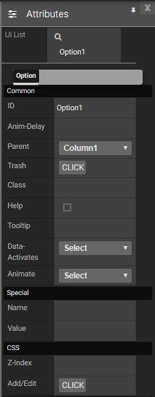
Attributes
|
|
Events
Name |
Description |
Click |
When check option is clicked |
Double Click |
When the option is double clicked. |
Mouse Down |
When the option is pressed down. |
Mouse Enter |
When the mouse pointer is moves in option while it is over. |
Mouse Leave |
When the mouse pointer is moves on over an option. |
Mouse Move |
When the mouse pointer is moving while it is over an option. |
Mouse Out |
When the mouse pointer moves out of an option. |
Mouse Over |
When the mouse pointer is moves on option while it is over. |
Mouse Up |
When the mouse pointer is pressed up. |
Focus In |
When the option is clicked. |
Focus Out |
When the mouse pointer is pressed while it is over a option. |
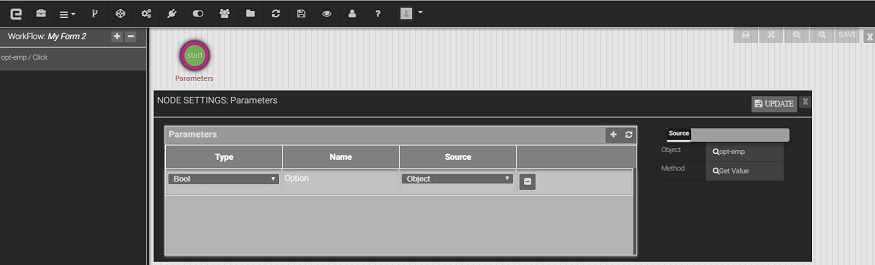
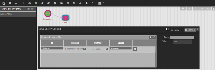
Methods
Get Value: To get Boolean value of the option.
Set Value: To set the Boolean value of the option.
Created with the Personal Edition of HelpNDoc: Free iPhone documentation generator