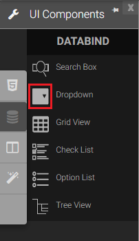
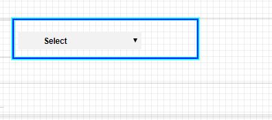
Drop Down
The Dropdown list component is list box that shows the selectable items in a vertical list. If the number of items exceeds the height of the component, a scrollbar is shown. The component allows selecting multiple values.
|
|
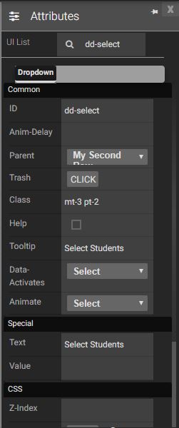
Attributes
|
|
Events
Name |
Description |
Click |
When the dropdown list is clicked |
Double Click |
When the dropdown list is double clicked. |
Mouse Down |
when mouse pointer is down from the dropdown list |
Mouse Enter |
When the mouse pointer is moves in the dropdown list while it is over. |
Mouse Leave |
When the mouse pointer leaves in the dropdown. |
Mouse Move |
When the mouse pointer is moving over the dropdown list. |
Mouse Out |
When the mouse pointer moves out of a dropdown list. |
Mouse Over |
When the mouse pointer is moving over the dropdown list. |
Mouse Up |
When the mouse pointer is pressed up. |
Focus In |
When the dropdown is clicked. |
Focus Out |
When the mouse pointer is pressed while it is over a dropdown list. |
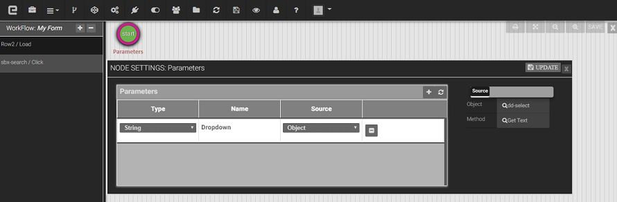
Methods
Get Text Method: To get text of the drop down.
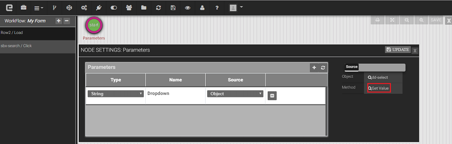
Get Value: To get value of the dropdown.
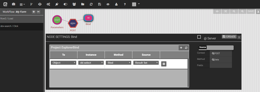
Bind method: we will bind the dropdown using this View Data.
Created with the Personal Edition of HelpNDoc: Full-featured EPub generator