|
Type
|
Name
|
Description
|
UI
|
Delete
|
It is used to save the data in grid.
|
UI
|
Save
|
It is used to save the data in grid.
|
UI
|
Delete Row
|
It is used to delete entire row in grid.
|
UI
|
Serial Number
|
It is used to giving the column numbers in grid.
|
UI
|
Undo
|
It is used to remove data in temporarily in grid.
|
UI
|
Add Row
|
It is used to add row in grid.
|
UI
|
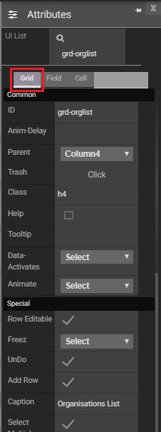
Caption
|
It specifies caption of the grid.
|
UI
|
Select Multiple
|
In rows are select in single, multiple or all.
|
General
|
ID
|
Displays title of the component.
|
General
|
Parent
|
Displays where it is located in the component.
|
General
|
Class
|
A CSS style to be attached to the component. This style is added in addition to styles output by the component.
|
General
|
Trash
|
Users to permanently delete component.
|
CSS Attributes
|
Z-index
|
The z-index specifies the stack order of an element. An element with greater stack order is always in front of an element with a lower stack order.
|
CSS Attributes
|
Add/Edit
|
It has CSS Editor. We can write different CSS code for each component.
|
CSS Attributes
|
Width
|
The tab control width. This attribute will allow for setting exact width.
|
CSS Attributes
|
Height
|
The tab control height. This attribute will allow for setting exact height.
|
|
Created with the Personal Edition of HelpNDoc: Easily create PDF Help documents