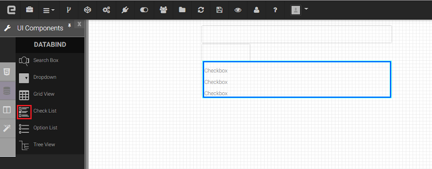
Check List
A checkbox List can be used for Multiple selections or deselections. When it is selected, a check mark appears in the box from the checkbox List. You can add a Multiple text label to a Multiple check boxes and place it to the left, right, above, or below the check box. It is allows the user to select a true or false condition and used to set a value on or off .
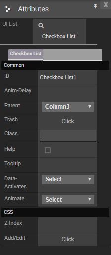
Attributes
|
|
Events
Name |
Description |
Click |
When checkbox list is clicked |
Double Click |
When the check box list is double clicked. |
Mouse Down |
When the check box list is pressed down. |
Mouse Enter |
When the mouse pointer is moves in check box list while it is over. |
Mouse Leave |
When the mouse pointer is moves on over a button. |
Mouse Move |
When the mouse pointer is moving while it is over a check box list. |
Mouse Out |
When the mouse pointer moves out of a check box list. |
Mouse Over |
When the mouse pointer is moves on check box list while it is over. |
Mouse Up |
When the mouse pointer is pressed up. |
Focus In |
When the check box list is clicked. |
Focus Out |
When the mouse pointer is pressed while it is over a check box list. |
Created with the Personal Edition of HelpNDoc: Free Kindle producer