Button
Button is an essential way to interact with and navigate through a data, and should clearly communicate what action will occur after the user taps them. Buttons can consist of text. Drag the component onto the page in the place where you want the text to display. The button component is a re-sizable, rectangular button that a user can press with the mouse to initiate an action in the application.
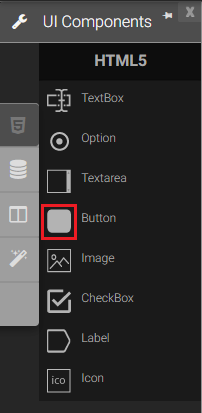
Button in Palette |
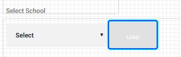
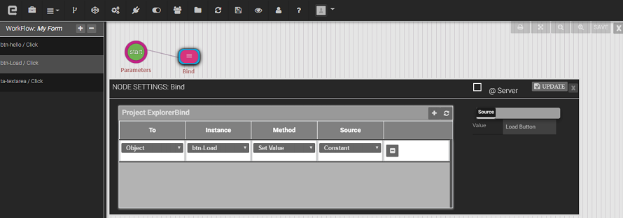
Sample Load Button |
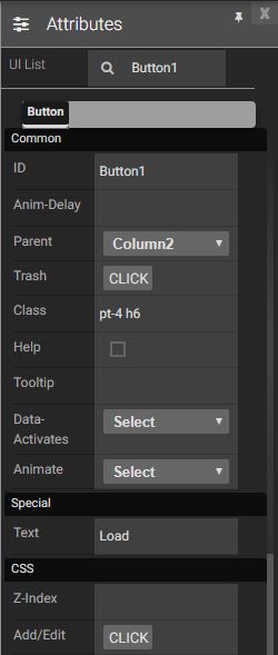
Attributes
|
|
Name |
Description |
Click |
When button is clicked |
Double Click |
When the button is double clicked. |
Mouse Down |
When the mouse button is pressed down. |
Mouse Enter |
When the mouse pointer is moves in the button while it is over. |
Mouse Leave |
When the mouse pointer is moves on over a button. |
Mouse Move |
When the mouse pointer is moving while it is over a button. |
Mouse Out |
When the mouse pointer moves out of a button. |
Mouse Over |
When the mouse pointer is moves in the button while it is over. |
Mouse Up |
When the button is pressed up. |
Focus In |
When the button is clicked. |
Focus Out |
When the mouse pointer is pressed while it is over a button. |
Methods
Get value Method: Will return the UI Text value of the button.
Set value Method: Will set the UI Text value of the button.
Created with the Personal Edition of HelpNDoc: Create HTML Help, DOC, PDF and print manuals from 1 single source